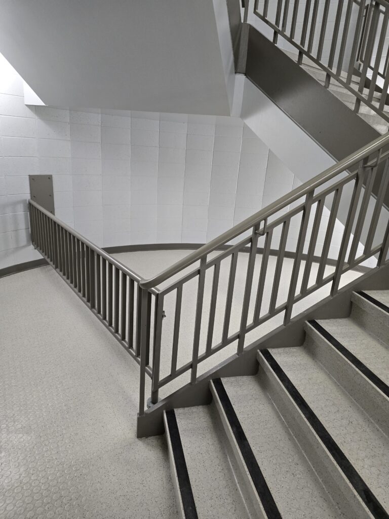
I feel as if these are my three most successful images in drawing the eye around the image. The staircase not only has the all of the lines drawing the eye around, the different lighting intensities help balance that pull.
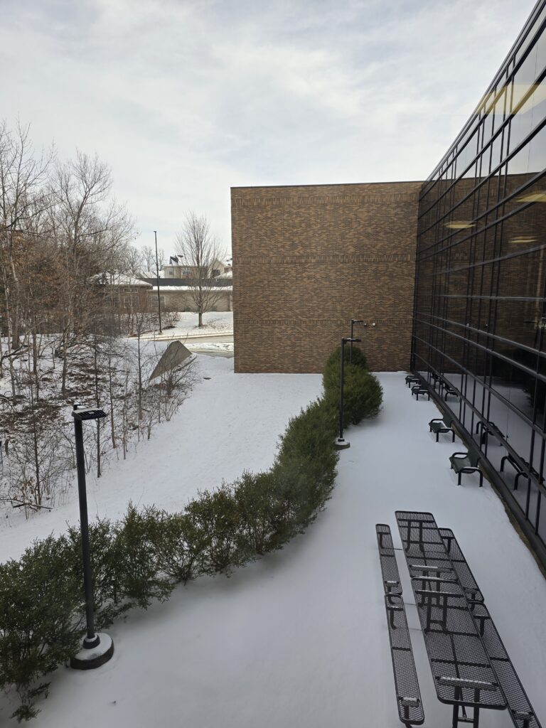
The hedge leading into the brick wall feels as if it were made as an artistic joke. Almost all of the lines lead toward that large blank wall. There’s a Dar Williams lyric about “a vision as big as a great big wall”. The hedge, the tables, the windows, and the scrub wood all lead there.
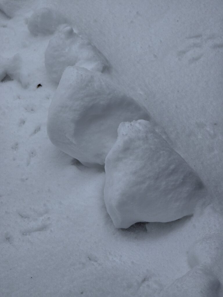
Previous shoveling piles on the edge of my driveway probably needed more exposure. I did like how the light around one led into the arch of the next drawing the eye up.
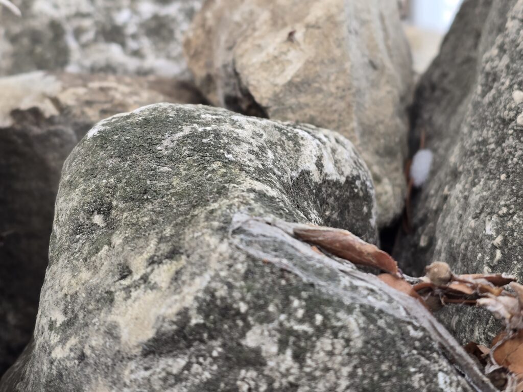
These also succeed in drawing the eye through the image. They do seem to be missing something. I think the rocks needed a slightly (very slightly) greater depth of field or that the focal point be further along the rock.
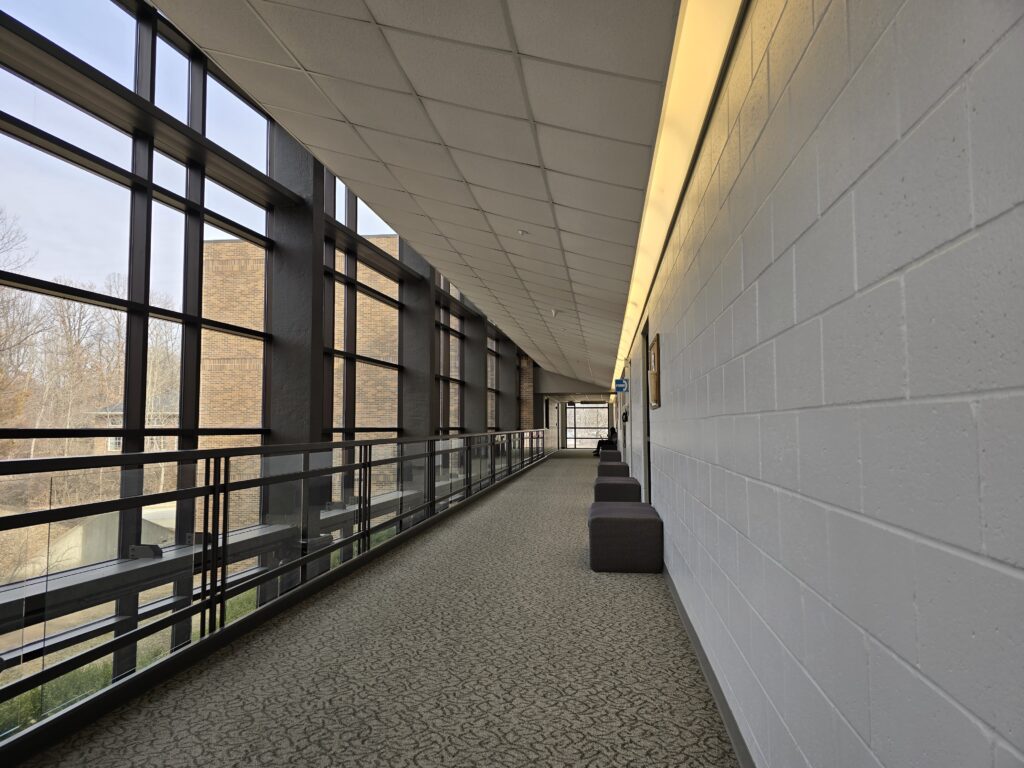
The hallway image has great lines but they need something for all of them to point to. Also for me to be more centered in the hallway when I took the image.
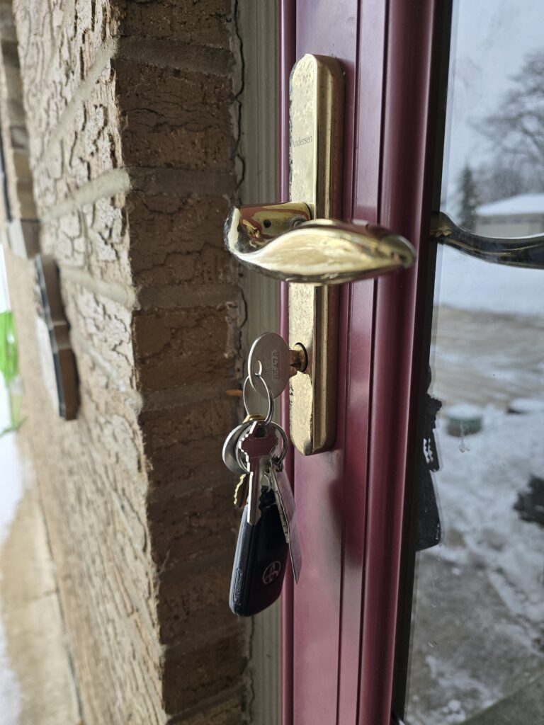
The keys have good color and the brass pulls you in towards them but the hose on the left side keeps pulling my eye with the bright color. If cropping were allowed, I think this image would be much better with just that little bit of a crop. Or I could have angled slightly to the side so that the hose wasn’t visible but I didn’t notice it until uploading. I do like the highlights of the keys and key-fob against the shadowed brick.
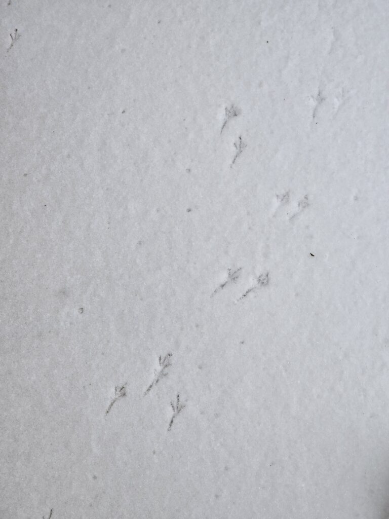
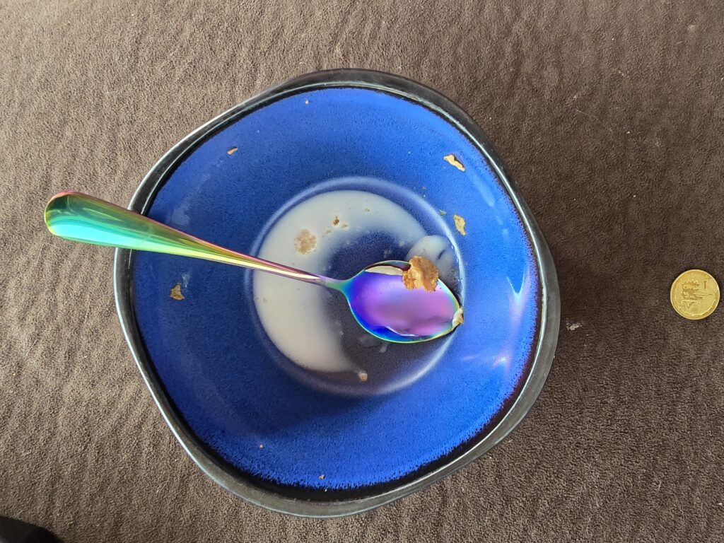

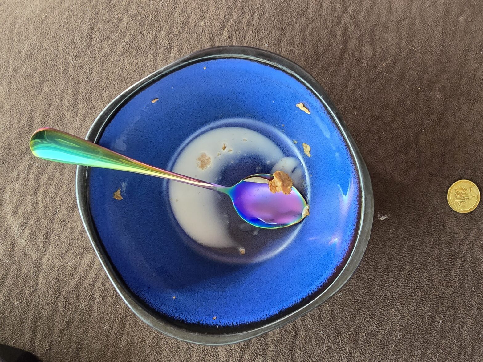
I’m trying to figure out why I took the first of these three the way I did. It needs to be pulled so that the bottom prints are down and to the left a small amount. As it currently is there is nothing balancing the heavy lean to the right. Scrolling through my images this morning I realized how few of them I liked that didn’t feel repetitive when viewed as a group. So cereal bowl and spoon. The spoon’s color and reflective surface pulls the eye towards the circle of milk which loops back to the spoon looping around again. I would really like this one if it were just the bowl but I felt the need to overthink it and added the coin and it’s too unconnected visually and mentally. The cleared path is fine, it just feels boring as a visual cliché.
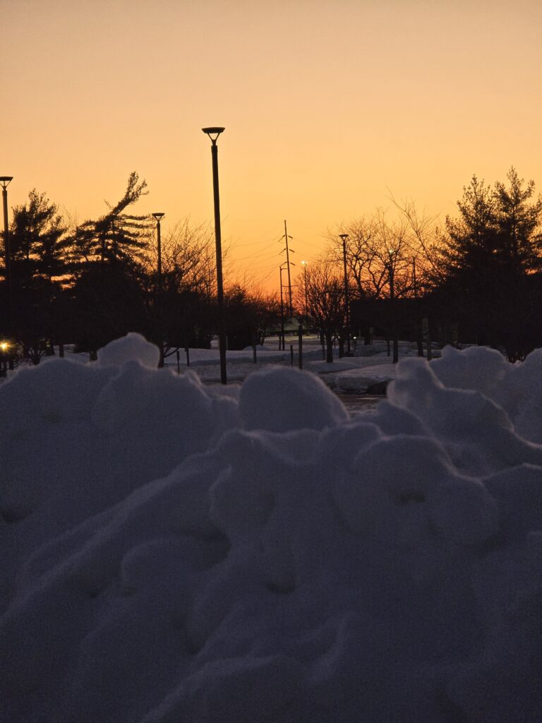
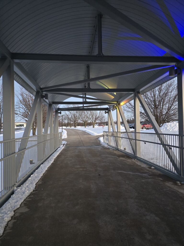
The snow plowed pile failed as an image because I wasn’t trying to focus on anything in particular with my phone. I liked the orange of the sunset and the light highlighting all of the different weird lumps of snow. Last night was when I realized that the images didn’t have to be taken with our cell phones and I hope my future images for these assignments have more intentional focus and depth of field. This bridge, much like the hallway above, has good lines that need something to be pointed at.
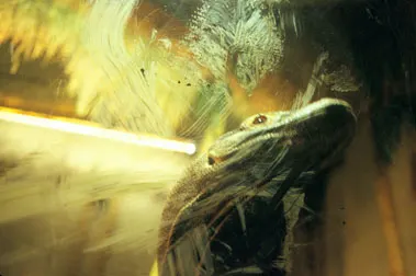
I chose this image by Rebecca Norris-Webb as everything leads to the dragon’s head. The light in the background, the smears on the glass, both the ones that frame the lizard’s dark underbelly and the handprint over the head and the shadow in the right corner all point to the head. The shadow on the mouth draw the eye further in to try to catch the eye of the Komodo Dragon. Her balance of light and shadow is chef’s kiss. It soothes my brain even if the lack of sharp focus can at times make me uncomfortable. Her collection that this image comes from is about the windows and walls between the creatures. A Who is viewing Who sort of thing.