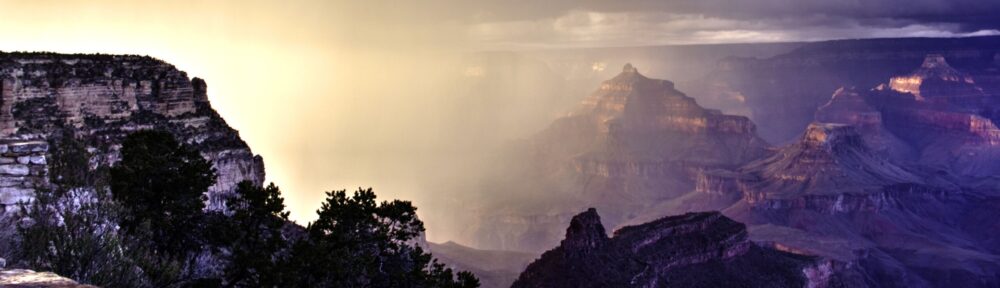
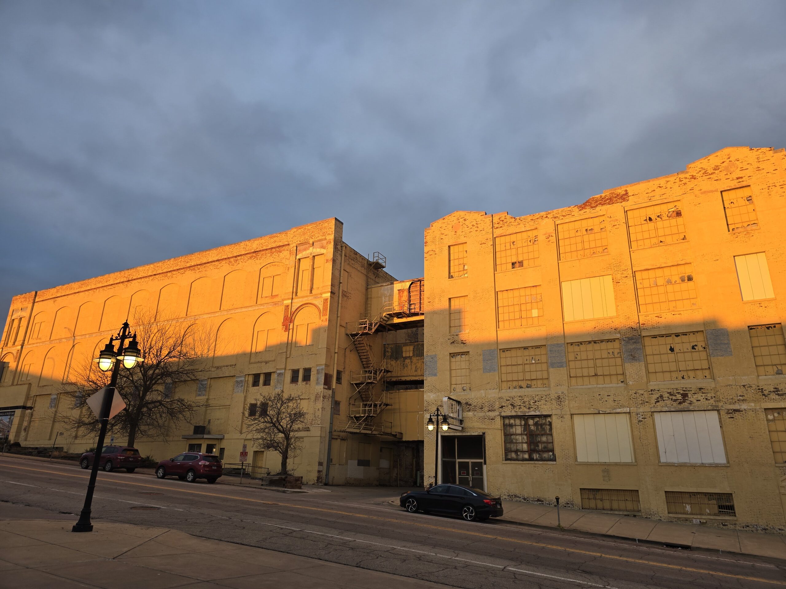
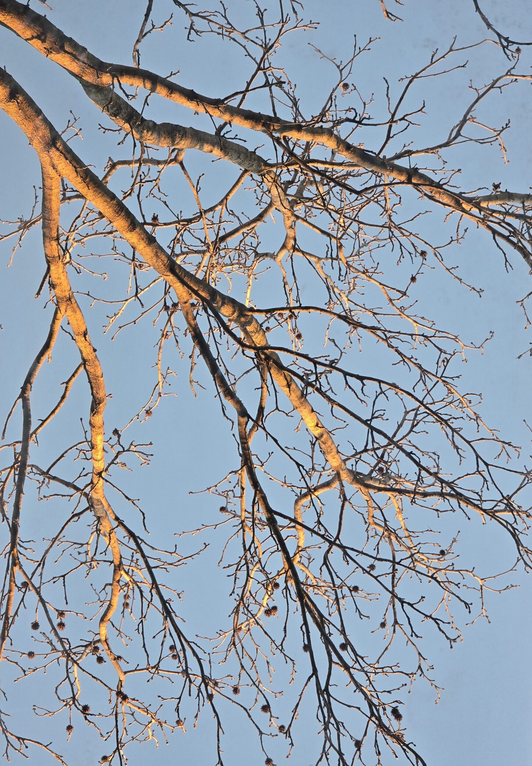
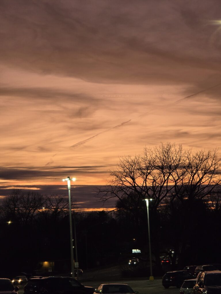
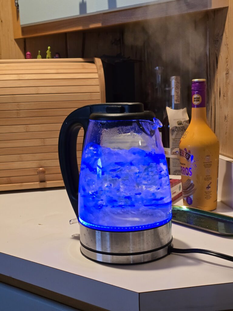
I hadn’t even been thinking about the project when I took the first picture for it. The orange building against the storm clouds at sunset was just striking. It occurred to me that it was because the colors were complementary and so my homework began. While I very definitely do have color preferences, I did try to work other colors in. Every time I walk down that hall I am surprised by how my sweatshirt blends into it. Daniel Sigg’s photography involves using a blue LED light and a macro lens and seems to be more a study of the shade of blue than of any particular item to took photos of, turning them all into abstract barely recognizable images. I thought about trying to interpret some of those works but I felt it would be less about understanding the colors than the lens at that point. I do love this shade of blue though.
Metering for shadows is an interesting experiment. If you meter for the shadow, in full daylight, the light area gets overexposed.
1/10 s @ F5.6 ISO 1001/10 s @ F5.6 ISO 1001/125 s @ F5.0 ISO 1001.6s @F5.6 ISO 32001/15s @ F5 ISO 1001/640 s @ F5.6 ISO 1001/500 s @ F5.6 ISO 1001/250 s @ F8 ISO1001/500 s @ F5.6 ISO 1001/125 s @ F5.6 ISO 100
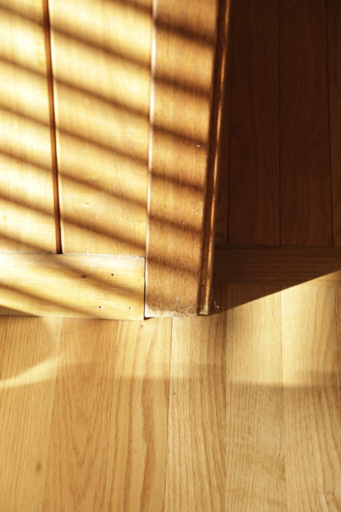
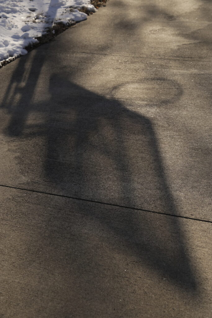
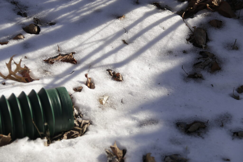
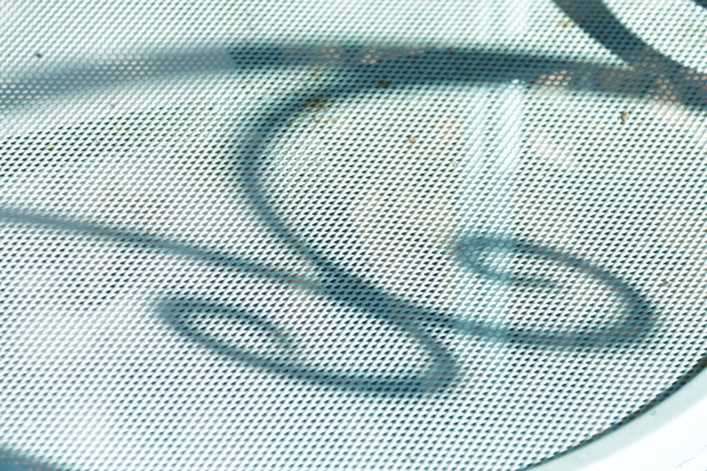
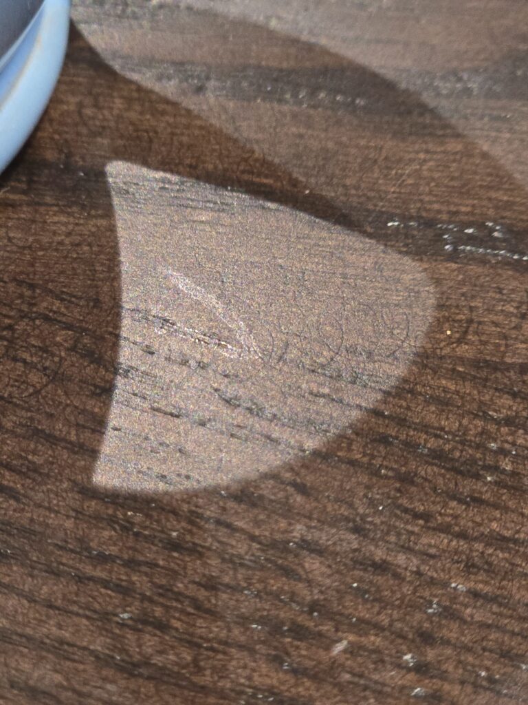
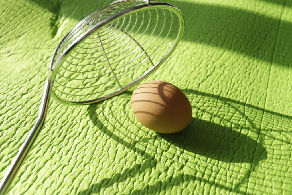
The first two images in this gallery are the same thing in a flagrant violation of the stated instructions. They are going for different things though. The first is the shadow of the plant and the second is the light ripples in the shadow from the light bouncing off the planter. The brown paper was interesting because the shadows all have different densities depending on how many layers the sun had to shine through. The cat tree tower shadow was interesting because of how nebulous it was. It came from diffused light through the doorway. A bunch of focused-sourced diffused light? I just liked the contrasting angles of the shadows crossing the different grains. The basketball hoop has the sharp dense shadows as well as the thin ones of tinted glass. The can on the snow has those dark shadows of the leaves and can crease as well as the shadow with the snow reflecting more light into it. The blue wall was interesting as both the shadow and the light wiped all color from it. I took a picture of it metered for both the shadow and the light. I posted it metered for the light as the over-exposure is violent and bright and some details are still visible in the shadow. The down spout looked as if it were sucking up the shadows. Designs on mesh. Mug handle with shadows from different light sources. The next several were inspired by the art I chose. I liked the idea of all the different textures being highlighted by the shadows, and regret I didn’t use an apple instead of the lemon for a different texture. My favorite is the last one.
1/125 s @ F5.6 ISO 1001/125 s @ F5.6 ISO 1001/125 s @ F5.6 ISO 100
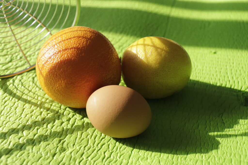
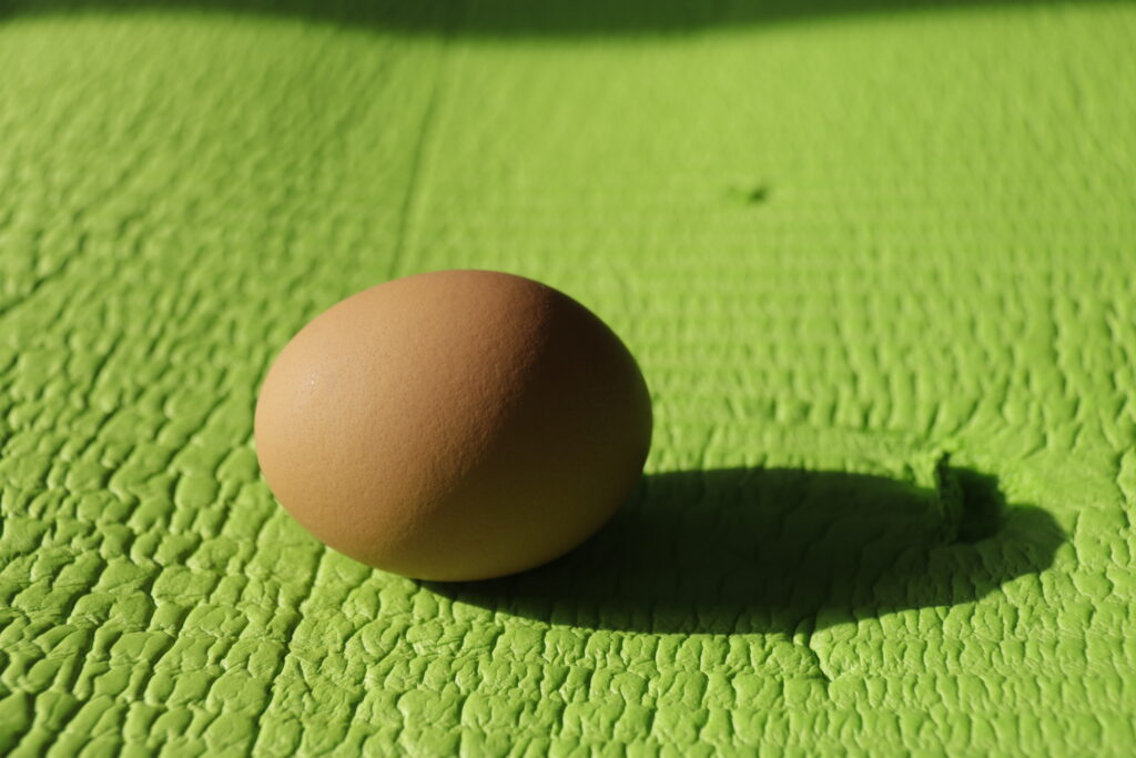
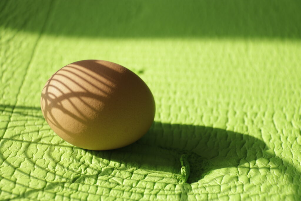
Erika Ottela is apparently one of a number of artists that has done shadow work on eggs. I don’t think she was the artist I was originally thinking of when I googled shadows on eggs but I did like how her photo came out. I used her image as inspiration for the yoga mat/egg/fruit photos.
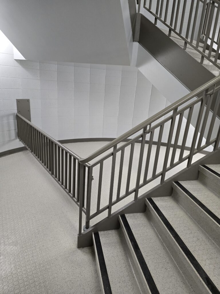
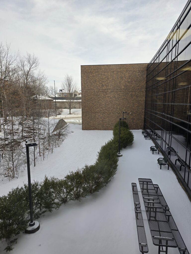
I feel as if these are my three most successful images in drawing the eye around the image. The staircase not only has the all of the lines drawing the eye around, the different lighting intensities help balance that pull. The hedge leading into the brick wall feels as if it were made as an artistic joke. Almost all of the lines lead toward that large blank wall. There’s a Dar Williams lyric about “a vision as big as a great big wall”. The hedge, the tables, the windows, and the scrub wood all lead there. Previous shoveling piles on the edge of my driveway probably needed more exposure. I did like how the light around one led into the arch of the next drawing the eye up.
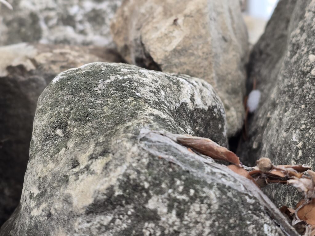
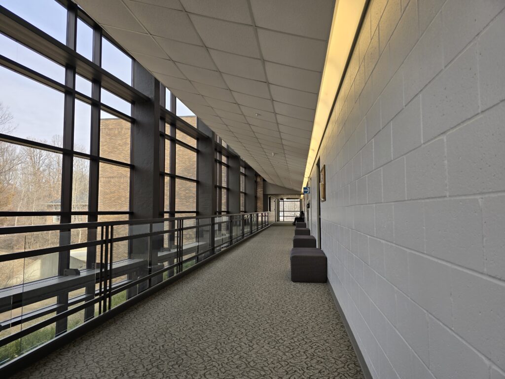
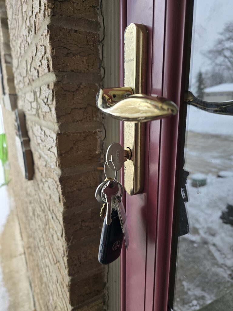
These also succeed in drawing the eye through the image. They do seem to be missing something. I think the rocks needed a slightly (very slightly) greater depth of field or that the focal point be further along the rock. The hallway image has great lines but they need something for all of them to point to. Also for me to be more centered in the hallway when I took the image. The keys have good color and the brass pulls you in towards them but the hose on the left side keeps pulling my eye with the bright color. If cropping were allowed, I think this image would be much better with just that little bit of a crop. Or I could have angled slightly to the side so that the hose wasn’t visible but I didn’t notice it until uploading. I do like the highlights of the keys and key-fob against the shadowed brick.
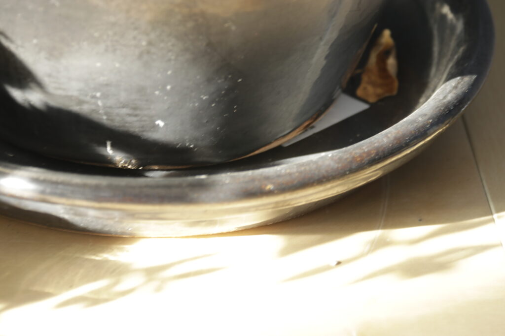
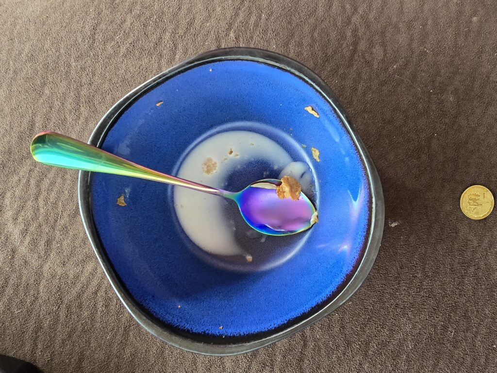
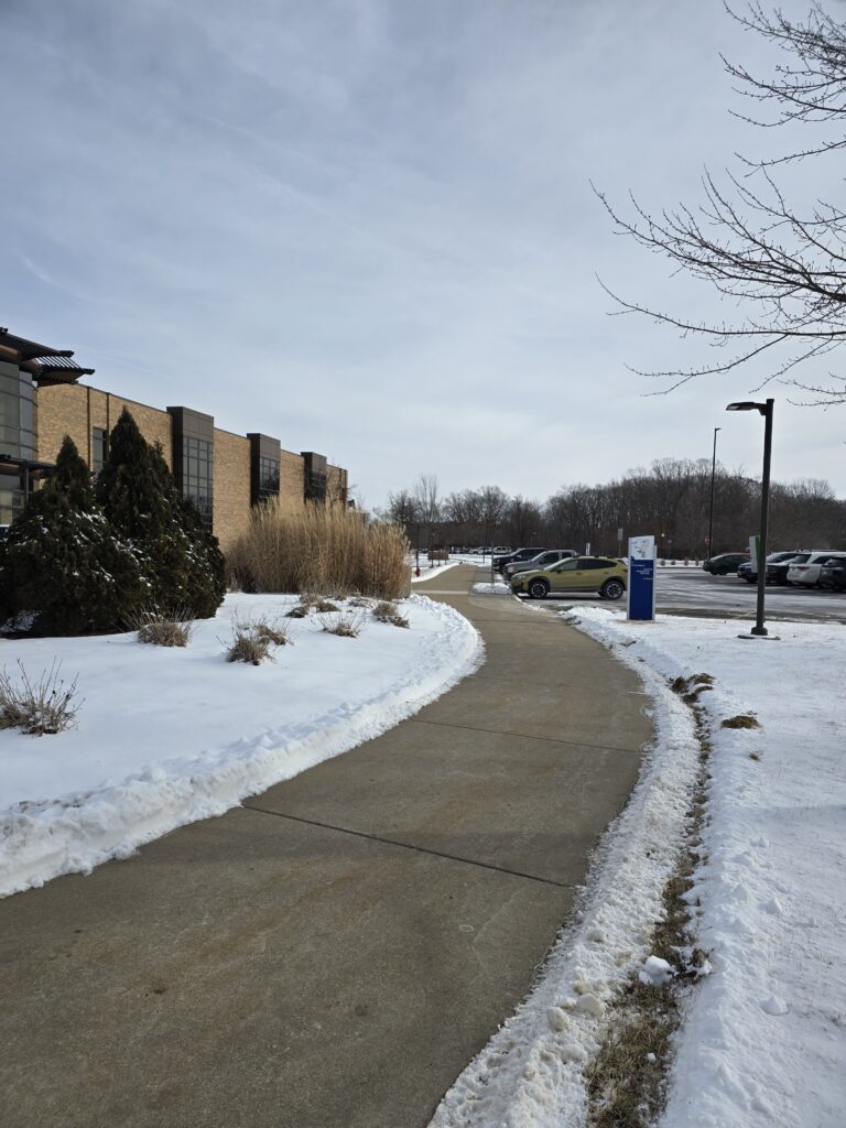
I’m trying to figure out why I took the first of these three the way I did. It needs to be pulled so that the bottom prints are down and to the left a small amount. As it currently is there is nothing balancing the heavy lean to the right. Scrolling through my images this morning I realized how few of them I liked that didn’t feel repetitive when viewed as a group. So cereal bowl and spoon. The spoon’s color and reflective surface pulls the eye towards the circle of milk which loops back to the spoon looping around again. I would really like this one if it were just the bowl but I felt the need to overthink it and added the coin and it’s too unconnected visually and mentally. The cleared path is fine, it just feels boring as a visual cliché.
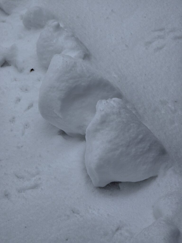
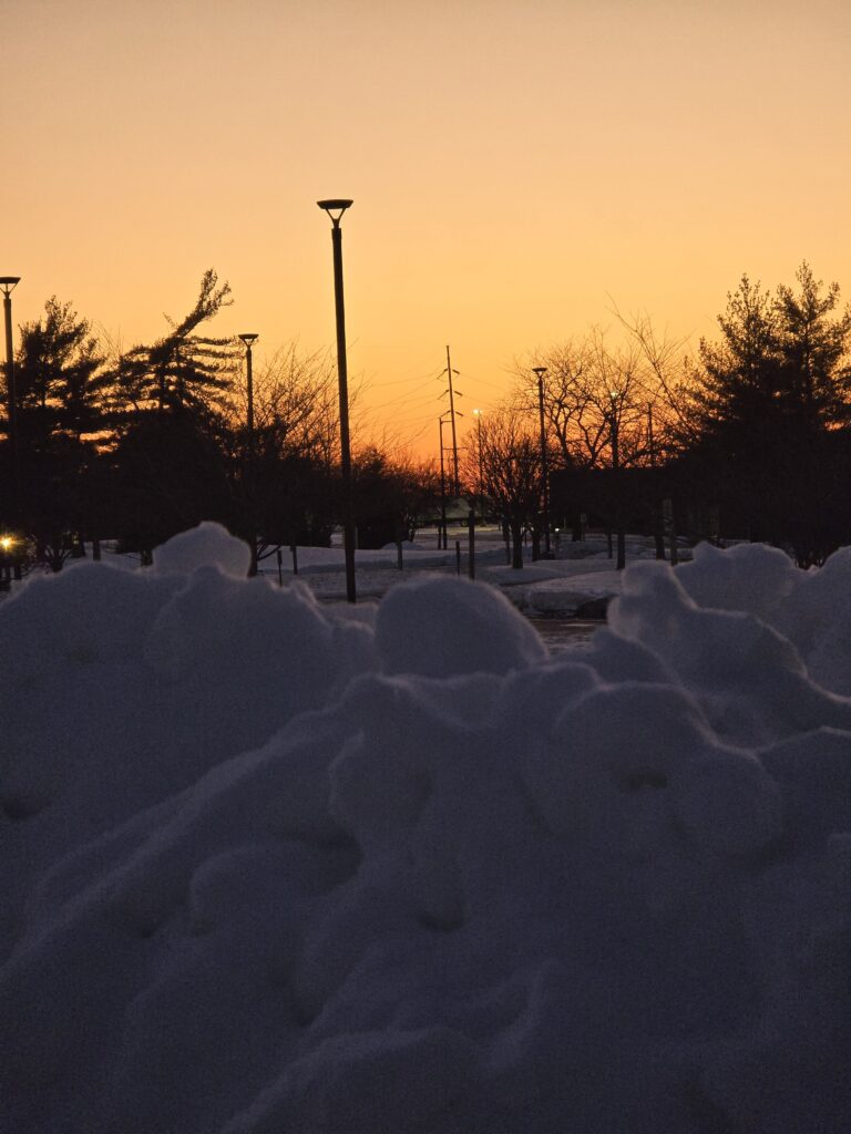
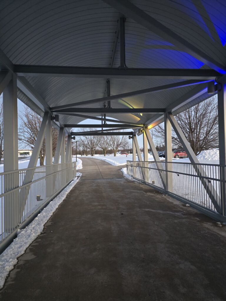
The snow plowed pile failed as an image because I wasn’t trying to focus on anything in particular with my phone. I liked the orange of the sunset and the light highlighting all of the different weird lumps of snow. Last night was when I realized that the images didn’t have to be taken with our cell phones and I hope my future images for these assignments have more intentional focus and depth of field. This bridge, much like the hallway above, has good lines that need something to be pointed at.
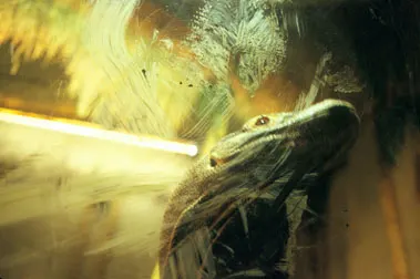
Komodo Dragon Rapid City S. Dakota 2004 Rebecca Norris-Webb
I chose this image by Rebecca Norris-Webb as everything leads to the dragon’s head. The light in the background, the smears on the glass, both the ones that frame the lizard’s dark underbelly and the handprint over the head and the shadow in the right corner all point to the head. The shadow on the mouth draw the eye further in to try to catch the eye of the Komodo Dragon. Her balance of light and shadow is chef’s kiss. It soothes my brain even if the lack of sharp focus can at times make me uncomfortable. Her collection that this image comes from is about the windows and walls between the creatures. A Who is viewing Who sort of thing.
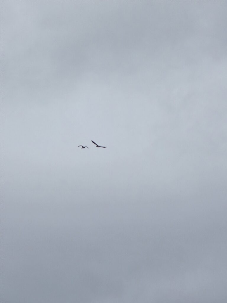
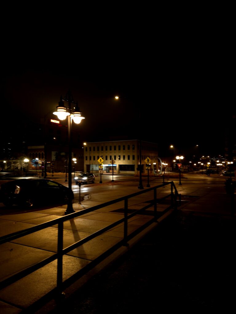
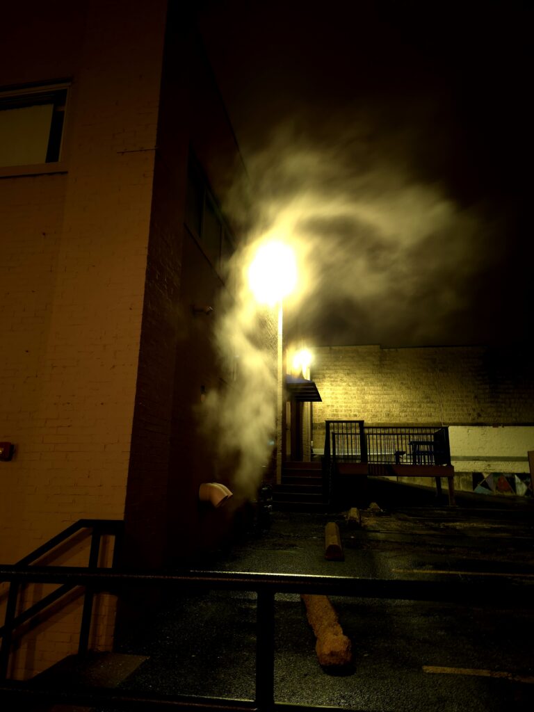
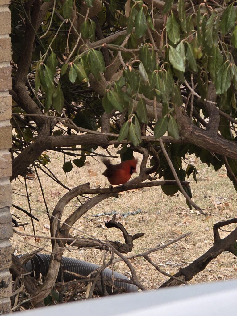
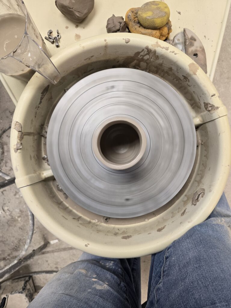
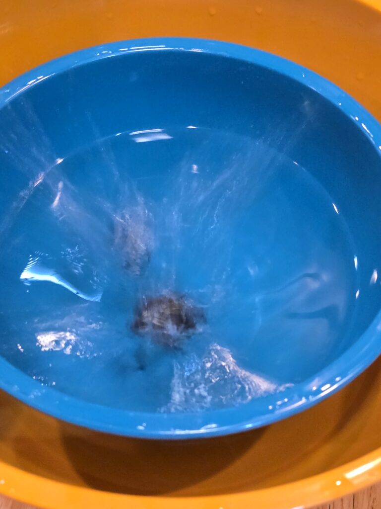
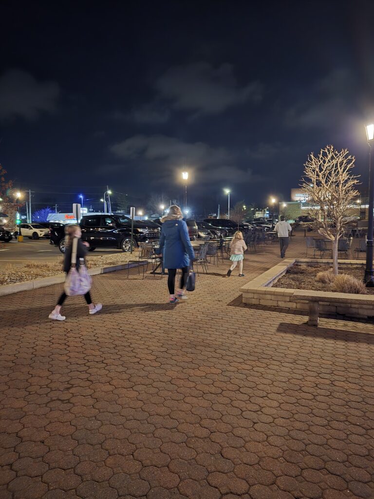
FanBirds FlyingCarCity NightCardinalContrailPottery WheelSplishLeft TurnAfter ClassRoiling Water Escaping Steam
I read this assignment at the beginning of the week, and had plans for taking pictures of geese flying off, water moving through ice, and several other things. I thought more and more about it without rereading the assignment which warped the assignment in my head into how to demonstrate motion has been there. I also didn’t want to pose photos of motion which are the two points I went sideways on the assignment and should have reread it.
The geese flying overhead should have been zoomed in more and I should have followed them blurring the sky more as I traced their motion. I think trying to spin along with the fan would have been entertaining though perhaps contributing to dizziness. I was trying to get the blur of motion with more light on the blades without blinding out the brightness of the sky. I actually really like the pottery wheel image. Though the colors are similar I do feel it has enough brightness and contrast to make it interesting. The car was an attempt of getting a car going through the roundabout, though it turned up the street. It had been the only car in around five minutes so I didn’t want to wait around in those temperatures to get another car. I should have though as I drove off there were several cars in that round about with me. I had thought my husband taking that left turn would blur his hands more while keeping his body in that torqued position. It was brighter than it looked. Contrail was the thinking too deeply about what motion is and how to show it. I think if I was redoing it I would try to get the actual jet going through the sunset. After class turned out better than I hoped as the family hadn’t been meant to be in the photograph. They walked up as I was trying to get my husband walking across the courtyard. They all have different paces and postures and I absolutely loved that all of their legs are blurred at different spots . Splish is dumping various dice into double bowls of water. I was trying to get the splash up. I needed a different background to get it clearly. The cardinal kept hopping around. He’s clearly ready to keep going. I do really like moving water and lights shining through it. Once again I wish I had set a different background up so that the water and steam would be more apparent and the background was less distracting. More steam in a noir graphic novel setting. I didn’t set myself up evenly . I would have cropped but it had been said that cropping wasn’t wanted.
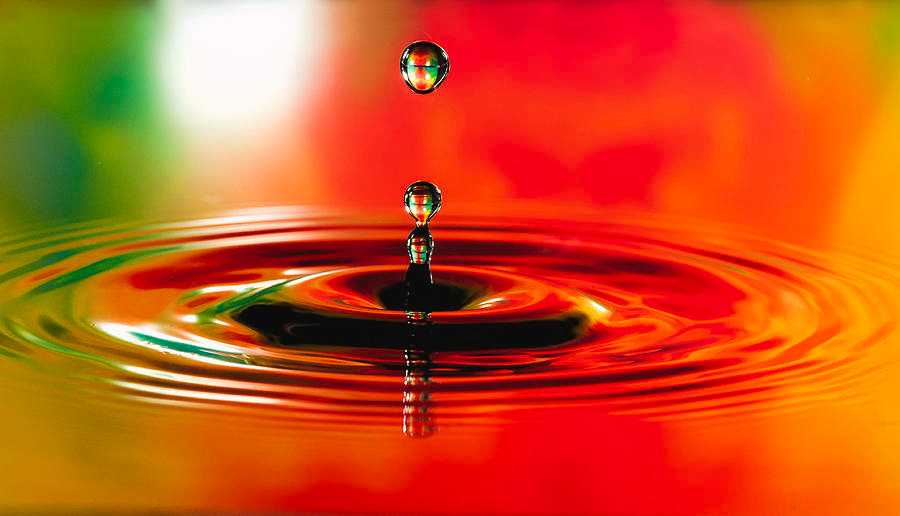
Phyllis Taylor has this incredibly lit and paused stop action of a water droplet falling. There are a lot of artists out there that have similar images. It’s a bit of a photography trope. I have spoken with photographers who have done it in the past and it’s usually a process of a contained space and light. I didn’t try to duplicate it exactly. The lighting and speed would have needed to be much more managed. I did try for the bright colors even if I didn’t try for the flat surface.